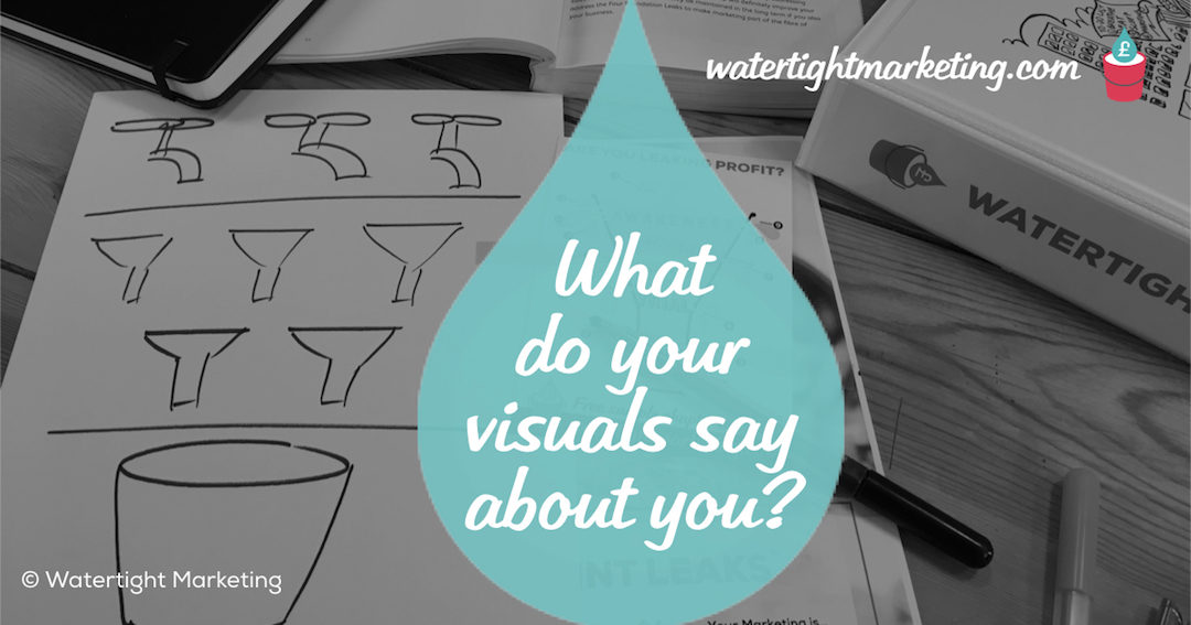
I’ve just come off a coaching call with a client, we’re working on stemming Leak #3: No emotional connection and we got to talking about their visuals. There are two areas I ask clients to look at when considering their company’s visual identity – the concept and the consistency.
What concept is your visual identity expressing?
To help buyers feel comfortable in forming a relationship with you, your company visuals need to express the outcome they might achieve by being your customer.
CASE STUDY: Ascentor
Ascentor, an information risk consultancy, was having trouble differentiating their business. They provide high-value consulting services, where they really understand the client in question and build a holistic information security strategy specifically for them, covering everything from their people policies to IT systems. They found themselves competing against businesses selling off-the-shelf technical quick fixes. Looking at their marketing materials, it was hard to tell Ascentor apart from these types of competitor. Their imagery was almost identical – pictures of computers and data represented in binary code. Working with an experienced team, they developed a new visual identity that more accurately expressed the sense of their big picture approach and enabled Ascentor to move the conversation beyond the server cupboard.
How consistent is your styling?
And, you build up trust by ensuring that everything you do is consistently represented.
CASE STUDY: VPW Systems
VPW provides a one-stop-shop for small business IT in Devon. They really wanted to set themselves apart as a local provider, with all the friendliness and accessibility that brings, but with the highest possible standards. Having spent some time codifying all the visual elements of the brand, they made an investment in a set of professionally-produced templates for Microsoft Office documents. These are now used to create all of their documentation. Managing Director, Vince Wilton, comments, “We spent a lot of money on the templates upfront, but they are probably the single biggest improvement I’ve made in our marketing. I now regularly get unsolicited compliments on the quality of our documents.” It was important for VPW to demonstrate that they have real attention to detail in everything they do. Having documents that consistently look the part is important to getting this message across.
Answering these questions for your business, and ensuring that your visual identity does these two jobs, will always help buyers to understand and trust you.
© Bryony Thomas | VA-Voom! brand by Andy Fuller.

Bryony Thomas
Author & Founder, Watertight Marketing
Bryony Thomas is the creator of the multi-award winning Watertight Marketing methodology, captured in her best-selling book of the same name. She is one of the UK's foremost marketing thinkers, featured by the likes of Forbes, The Guardian, Business Insider and many more, and in-demand speaker for business conferences, in-house sales days and high-level Board strategy days.


